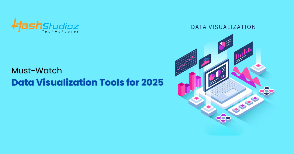
Every day, over 2.5 quintillion bytes of data are generated, and by 2025, it’s expected that 463 exabytes of data will be created each day. Data visualization is rapidly becoming a crucial component of business decision-making, as it allows organizations to make sense of large and complex datasets. By transforming raw data into visual elements like charts, graphs, and interactive dashboards, businesses can communicate insights in an intuitive and accessible way. With the increasing volume and complexity of data, the demand for data visualization tools is skyrocketing, and 2025 promises to bring even more innovative solutions to the market.
In this article, we will explore the top data visualization tools to watch in 2025. We’ll look at their features, advantages, and why they are poised to make an impact in the coming years.
Table of Contents
What is Data Visualization?
Data visualization is the graphical representation of information and data. By using visual elements like charts, graphs, maps, and infographics, complex data sets can be made more accessible and understandable. This practice allows users to gain insights quickly, making it easier to identify patterns, trends, and outliers.
The power of data visualization lies in its ability to help decision-makers digest complex data and make informed decisions. With business intelligence playing an increasingly vital role in various industries, the right data visualization tools can be a game-changer.
Why is Data Visualization Important?
Data visualization makes data easier to interpret and analyze by converting abstract data into formats that are visually intuitive. Here’s why data visualization is important for businesses:
- Better Decision Making: Visualization helps executives and stakeholders quickly understand trends, patterns, and outliers that inform business decisions.
- Improved Data Interpretation: It’s easier to identify correlations and anomalies when data is presented visually, especially for non-technical users.
- Faster Insights: Visual tools enable faster analysis, allowing organizations to respond to changing conditions swiftly.
- Enhanced Storytelling: A well-designed visualization can tell a compelling story that resonates with stakeholders, which is especially important for marketing and leadership.
- Boosting Productivity: By automating the creation of reports and dashboards, data visualization tools free up time for analysts to focus on deeper insights.
Have questions? Reach out to HashStudioz and discover how our data visualization solutions can benefit your business.
Top 10 Data Visualization Tools to Watch in 2025
As technology evolves, so do the capabilities of data visualization tools. From easy-to-use drag-and-drop interfaces to more advanced solutions for data scientists and analysts, here are some of the top tools to keep an eye on in 2025.
1. Tableau
Tableau has long been a dominant force in the world of data visualization. Known for its powerful features and user-friendly interface, it enables users to create interactive and shareable dashboards in minutes.
Why watch Tableau in 2025?
- Advanced AI Integration: Tableau continues to integrate artificial intelligence and machine learning, enhancing its analytical capabilities.
- Ease of Use: Drag-and-drop functionality makes it accessible for non-technical users, yet its complexity satisfies advanced analysts.
- Collaborative Features: Tableau’s cloud-based platform allows teams to collaborate in real-time.
In 2025, Tableau is expected to evolve with enhanced artificial intelligence (AI) and natural language processing (NLP) to further assist users in deriving insights quickly and efficiently.
2. Power BI
Microsoft’s Power BI is a robust, cloud-based business analytics tool that has become one of the most popular data visualization platforms worldwide. It integrates seamlessly with other Microsoft applications, including Excel and Azure, making it an excellent choice for organizations already in the Microsoft ecosystem.
Why watch Power BI in 2025?
- Natural Language Querying: Power BI allows users to ask questions in plain English and receive answers in the form of visualizations.
- AI-Powered Insights: The tool provides AI-driven insights, making it easy to analyze and visualize complex datasets.
- Affordable Pricing: Power BI offers a highly cost-effective solution, particularly for small to mid-sized businesses.
With Microsoft’s ongoing commitment to innovation, Power BI is expected to introduce even more advanced AI features, expanding its analytical capabilities for businesses of all sizes.
3. Qlik Sense
Qlik Sense is a self-service data visualization tool that empowers users to create interactive reports and dashboards without requiring extensive technical expertise. Its associative model allows users to explore data in an intuitive and dynamic way.
Why watch Qlik Sense in 2025?
- Associative Data Modeling: Qlik’s associative engine enables deeper insights by allowing users to explore data relationships in real time.
- Data Integration: Qlik integrates data from a variety of sources, including cloud storage and databases.
- AI Features: The tool comes with AI-powered data exploration capabilities that uncover hidden insights.
As data complexity continues to grow, Qlik Sense will remain a key player in helping organizations navigate vast amounts of data with powerful, self-service analytics.
4. Looker
Looker, now owned by Google, is a modern data visualization platform designed for enterprises seeking deep analytics and actionable insights. It’s particularly strong in its integration with Google Cloud, but also supports other data sources.
Why watch Looker in 2025?
- Embedded Analytics: Looker’s embedded analytics capabilities allow companies to integrate data visualizations directly into their applications.
- Data Governance: Looker offers strong governance features, ensuring that only authorized users have access to sensitive data.
- SQL-Based: For those familiar with SQL, Looker provides an easy-to-use interface to create custom reports and dashboards.
With Google’s investment in Looker, this platform is poised to continue its evolution in 2025, with even deeper integrations with Google Cloud and enhanced machine learning capabilities.
5. Sisense
Sisense is a data analytics and visualization tool known for its ability to handle complex data and integrate with various data sources. It’s used by organizations seeking advanced analytics and data visualization capabilities.
Why watch Sisense in 2025?
- AI-Driven Analytics: Sisense is known for integrating AI-powered analytics, allowing for smarter decision-making based on data-driven insights.
- Cloud-Native: Being cloud-native, Sisense can handle large volumes of data efficiently, which makes it ideal for scaling with business growth.
- Customizable Dashboards: Sisense allows users to create highly customizable dashboards that meet the unique needs of their business.
Sisense’s capabilities are expanding as it integrates even more AI and machine learning features, making it a critical tool for businesses seeking cutting-edge data visualization solutions.
6. Google Data Studio
Google Data Studio is a free data visualization tool that allows users to create interactive reports and dashboards from various data sources, including Google Analytics, Google Ads, and other third-party connectors.
Why watch Google Data Studio in 2025?
- Free and Accessible: Google Data Studio is completely free, making it an attractive choice for startups and small businesses.
- Google Ecosystem Integration: Its deep integration with Google’s suite of products (like Google Sheets, Google Analytics, and BigQuery) makes it a seamless solution for organizations using these tools.
- Customizable Reports: The tool provides a wide array of visualization options, enabling users to create highly customized reports.
As Google continues to refine its offerings, Google Data Studio is expected to integrate more advanced features, making it an excellent tool for businesses looking to scale and present data visually without hefty costs.
7. Domo
Domo is a cloud-based business intelligence and data visualization platform that enables organizations to visualize, analyze, and share real-time data insights. Its user-friendly interface and real-time capabilities make it an excellent tool for modern enterprises.
Why watch Domo in 2025?
- Real-Time Data: Domo is designed for real-time analytics, making it perfect for businesses that need immediate insights.
- Mobile-Friendly: With its mobile app, Domo allows users to access data insights on-the-go.
- Collaboration: Domo’s collaboration features allow teams to work together in real-time, fostering a culture of data-driven decision-making.
In 2025, Domo is expected to continue expanding its mobile and collaborative features, along with further enhancing its AI-powered analytics.
8. Zoho Analytics
Zoho Analytics is an easy-to-use data analytics and visualization platform that allows businesses to create interactive reports and dashboards. Its drag-and-drop interface makes it accessible to both beginners and professionals.
Why watch Zoho Analytics in 2025?
- Cost-Effective: Zoho Analytics is an affordable option for small businesses and startups looking to implement data visualization tools.
- Integration with Zoho Suite: Seamless integration with other Zoho products (CRM, email marketing, etc.) helps businesses use their data more effectively.
- AI-Powered Insights: Zoho Analytics uses AI to generate predictive insights, helping businesses stay ahead of trends.
Zoho Analytics is expected to grow significantly in 2025 as it adds more powerful AI features and increases its integrations with third-party applications.
9. Chartio (Acquired by Atlassian)
Chartio, now part of Atlassian, is a cloud-based data visualization platform designed for simple yet powerful analytics. It’s known for its intuitive interface and deep integration with various data sources.
Why watch Chartio in 2025?
- Ease of Use: Chartio’s drag-and-drop functionality makes it easy for users to create visualizations without the need for coding.
- Customizable Dashboards: Users can create custom dashboards that reflect their unique business needs.
- Atlassian Integration: As part of Atlassian, Chartio is expected to integrate with even more tools, enhancing its utility for organizations using the Atlassian suite.
Chartio’s future under Atlassian promises enhanced collaboration and even more data integration opportunities for users.
10. Plotly
Plotly is an open-source tool that specializes in creating highly interactive data visualizations. It’s widely used in scientific and academic circles but is gaining traction in business applications.
Why watch Plotly in 2025?
- Highly Interactive Visualizations: Plotly enables the creation of sophisticated, interactive graphs that can be embedded into web applications.
- Integration with Python: Plotly’s seamless integration with Python makes it a popular choice for data scientists and analysts.
- Open-Source: Being open-source, it offers customization and flexibility for advanced users.
With growing use in business intelligence, Plotly is expected to continue developing its interactive and customization features, making it a powerful tool for sophisticated data visualization in 2025.
Also Read: Big Data Analytics: Tools, Techniques, and Real-World Applications
Emerging Trends in Data Visualization for 2025
As data visualization continues to grow and evolve, new trends and innovations are emerging that will shape how businesses and organizations use visual storytelling in the years ahead. In 2025, we can expect these trends to redefine the future of data analysis and reporting, offering more insightful and engaging ways to represent data.
1. Increased Use of Artificial Intelligence and Machine Learning
Incorporating artificial intelligence (AI) and machine learning (ML) into data visualization tools is a trend that is gaining momentum. These technologies can automate the discovery of patterns, outliers, and insights from large datasets, offering more advanced and intelligent visualizations. Expect more AI-driven features such as automated data cleaning, predictive analytics, and advanced anomaly detection to be integrated into top-tier visualization platforms in 2025.
2. Interactive and Immersive Visualizations
Interactive data visualizations are already a significant trend, but we are likely to see them become even more immersive and engaging in 2025. Tools will allow users to interact with data in real-time, drill down into specific details, and explore different perspectives on data. With the growth of virtual reality (VR) and augmented reality (AR), it’s possible that we will see more immersive data visualizations that enable users to navigate through data in a 3D environment, improving engagement and understanding.
3. Storytelling with Data
While data visualization is about presenting data, in 2025, it will also increasingly be about storytelling. Data visualization tools will empower users to craft narratives around the data they present, helping to convey complex insights in a more compelling and digestible format. By combining data with context, businesses will be able to create more personalized experiences for stakeholders, focusing on the narrative behind the numbers rather than just presenting the raw data.
4. Real-Time Data Visualization
As data continues to evolve and businesses increasingly demand instant insights, real-time data visualization will be essential. Companies will need to make faster decisions based on up-to-the-minute data. In 2025, expect more visualization tools to feature real-time dashboards that automatically update as new data flows in. This will help businesses stay ahead of trends and quickly respond to changing market conditions.
5. Cloud-Based Data Visualization
The demand for cloud-based solutions will continue to rise in 2025 as businesses seek flexibility, scalability, and seamless collaboration. Cloud-based platforms provide users with the ability to access and share visualizations from anywhere, improving collaboration among teams. Cloud solutions also offer the ability to integrate with multiple data sources more efficiently, making them ideal for businesses that operate in diverse environments.
6. Data Democratization
As data becomes more accessible, data democratization will continue to play a central role in data visualization. In 2025, it will no longer be just data scientists or analysts who create visualizations; business users from all levels will be empowered to use self-service analytics tools to create their own dashboards and reports. This will reduce the dependency on IT departments and encourage more data-driven decision-making across organizations.
7. Mobile-First Data Visualization
With the increasing reliance on mobile devices, mobile-first data visualization will become a priority for visualization tool developers in 2025. More businesses are adopting mobile solutions for decision-making, and the ability to access dashboards and reports from smartphones and tablets will be critical. Expect a focus on responsive design, ensuring that visualizations remain clear and usable across various screen sizes and platforms.
8. Integration of Data Sources
As organizations continue to work with large, diverse data sets from various sources, there will be a stronger emphasis on integrating disparate data sources. In 2025, the top data visualization tools will offer seamless integration with both structured and unstructured data from a wide variety of sources, including social media, IoT devices, and external databases. This will allow users to create richer and more accurate visualizations by incorporating all relevant data points.
9. Enhanced Data Security Features
With the growing concerns about data privacy and cybersecurity, visualization tools will incorporate more advanced security features. Expect stronger data encryption methods, role-based access controls, and compliance with data protection regulations to be integrated into data visualization platforms. This will help organizations ensure that sensitive data remains protected while still enabling stakeholders to access the insights they need.
10. Personalized Visualizations
Another emerging trend is the personalization of data visualizations. In 2025, we can expect data visualization tools to become more tailored to individual users’ needs and preferences. Personalized dashboards that highlight specific KPIs (key performance indicators), offer relevant insights, and recommend actions based on past behavior will become more common. This will help businesses and users focus on what matters most to them, improving decision-making and productivity.
Challenges in Data Visualization
While data visualization offers numerous benefits, it is not without its challenges. As the volume, variety, and complexity of data continue to increase, organizations face several obstacles when it comes to effectively visualizing and interpreting this information. In this section, we’ll explore some of the key challenges in data visualization and provide insight into how businesses can address these hurdles.
1. Data Quality Issues
One of the biggest challenges in data visualization is ensuring the quality of the data being used. Poor data quality, such as inaccuracies, missing values, and inconsistencies, can severely undermine the reliability of visualizations and lead to misleading insights. If data is inaccurate or incomplete, visual representations of that data will not reflect the true picture, potentially causing decision-makers to draw incorrect conclusions.
How to overcome this challenge:
- Invest in data cleansing processes to ensure that data is accurate and consistent.
- Implement automated tools that detect and correct errors in real time.
- Encourage collaboration between data teams and business users to ensure data validity.
2. Overloading Users with Information
Another common challenge in data visualization is presenting too much information in a single view. Overcrowding visualizations with excessive data can overwhelm users, making it difficult to interpret key insights. This data overload can confuse users and dilute the effectiveness of the visualization.
How to overcome this challenge:
- Focus on simplicity and prioritize the most important insights for the target audience.
- Use interactive dashboards that allow users to drill down and filter data based on their needs.
- Apply data hierarchy techniques to guide the viewer’s attention to the most significant data points.
3. Choosing the Right Visualization Type
Selecting the wrong type of visualization for a particular dataset is a challenge that many organizations face. Different data types require different visual representations—what works for one dataset may not work for another. For instance, bar charts may work well for comparisons, but they might not be effective for showing trends over time.
How to overcome this challenge:
- Ensure that the chosen visualization method aligns with the nature of the data and the insights you want to convey.
- Invest in tools that provide suggestions for optimal visualization types based on the dataset.
- Stay up-to-date on best practices for visualization types and continuously evaluate whether the method still serves its purpose.
4. Scalability Issues
As businesses grow, so does the volume of data they must analyze. This creates scalability issues for data visualization tools, especially if the system is not designed to handle large datasets. Large datasets can result in performance bottlenecks, such as slow rendering times, and can lead to lag in visual reports, making it difficult for users to extract real-time insights.
How to overcome this challenge:
- Choose cloud-based solutions or tools that are specifically designed to handle big data.
- Optimize data processing by using techniques like data aggregation and indexing.
- Ensure that visualization tools can scale as data volumes grow and can provide a seamless experience for users.
5. Lack of Data Literacy
Data literacy is an essential skill for interpreting and analyzing data effectively. Many organizations face the challenge of a lack of data literacy among employees, which can hinder the effectiveness of data visualization efforts. Without a fundamental understanding of how to read, interpret, and question visualizations, users may miss important insights or misinterpret the data.
How to overcome this challenge:
- Invest in training to improve data literacy across the organization, particularly for decision-makers and stakeholders.
- Provide employees with resources such as data guides or tutorials to help them understand how to read and use visualizations properly.
- Ensure that visualizations are designed with clarity and accessibility in mind to aid interpretation, even for non-technical users.
6. Security and Privacy Concerns
With the growing use of data visualization comes an increased risk of data breaches and privacy issues. Organizations need to balance the need for accessible data visualization with the need to protect sensitive information. Sharing or displaying sensitive data without proper security measures can lead to compliance violations and damage to the organization’s reputation.
How to overcome this challenge:
- Implement role-based access control to restrict sensitive data to authorized users.
- Ensure that visualizations are encrypted and compliant with relevant privacy laws (e.g., GDPR, CCPA).
- Use data anonymization techniques when sharing or visualizing personally identifiable information (PII).
7. Complexity of Integration
Integrating data from multiple sources—such as databases, spreadsheets, cloud platforms, and third-party applications—can be a complex task. Many organizations face challenges when trying to merge data from these diverse sources into a single, cohesive visualization. This complexity can delay the creation of meaningful reports and dashboards.
How to overcome this challenge:
- Use data integration tools that facilitate the seamless merging of multiple data sources into one platform.
- Ensure that your visualization tools are compatible with various data formats and sources.
- Invest in ETL (Extract, Transform, Load) tools to standardize and clean data from disparate sources before creating visualizations.
8. Real-Time Data Visualization
Real-time data visualization presents unique challenges, particularly when it comes to ensuring that the data being displayed is up-to-date and accurate. With the constant flow of new data, keeping dashboards and reports updated in real-time can be resource-intensive and technically challenging.
How to overcome this challenge:
- Use streaming data technologies that automatically update visualizations as new data is received.
- Ensure that data sources are connected and synchronized in real-time to avoid discrepancies.
- Monitor system performance and ensure that visualizations don’t slow down or experience delays when displaying real-time data.
9. Interpretation of Visualizations
While data visualizations make it easier to digest complex data, interpreting these visualizations still requires a level of expertise. Viewers may misinterpret visual cues, such as colors or chart types, and could arrive at inaccurate conclusions. This is especially true for individuals with limited data literacy or experience with data visualization.
How to overcome this challenge:
- Include clear legends, labels, and tooltips to make visualizations easier to interpret.
- Provide contextual information or explanatory text alongside visualizations to clarify their meaning.
- Make use of best practices to ensure that visual elements are standardized and easy to understand across various platforms.
10. Maintaining Consistency
Consistency is key to creating effective data visualizations. Without a standardized approach, it becomes difficult to compare different visualizations across various reports or dashboards. This can lead to confusion or a lack of trust in the data.
How to overcome this challenge:
- Establish design standards and templates for creating visualizations to maintain consistency across the organization.
- Use consistent color schemes, fonts, and chart types to help users easily navigate between different visualizations.
- Ensure that all visualizations align with the overall goals of the organization and clearly convey the intended message.
Maximize the Potential of Data with HashStudioz’s Expert Data Visualization Services
HashStudioz is a leading IT services company that specializes in innovative technology solutions, including big data analytics, AI, mobile app development, and cloud services. With a focus on transforming complex data into actionable insights, HashStudioz offers expert Data Visualization Services to help businesses make data-driven decisions.
Through interactive dashboards, real-time data feeds, and visually compelling reports, HashStudioz enables organizations to easily interpret and act on key data insights.
Conclusion
The landscape of data visualization tools is continuously evolving, with 2025 expected to bring even more innovative and user-friendly solutions to the forefront. Whether you’re a large enterprise or a small business, choosing the right tool can significantly enhance your ability to make data-driven decisions.
From the tried-and-true powerhouses like Tableau and Power BI to up-and-coming solutions like Zoho Analytics and Plotly, there are tools for every business need and expertise level. As we move into 2025, data visualization will become an even more integral part of decision-making, driving smarter, faster, and more informed business strategies.