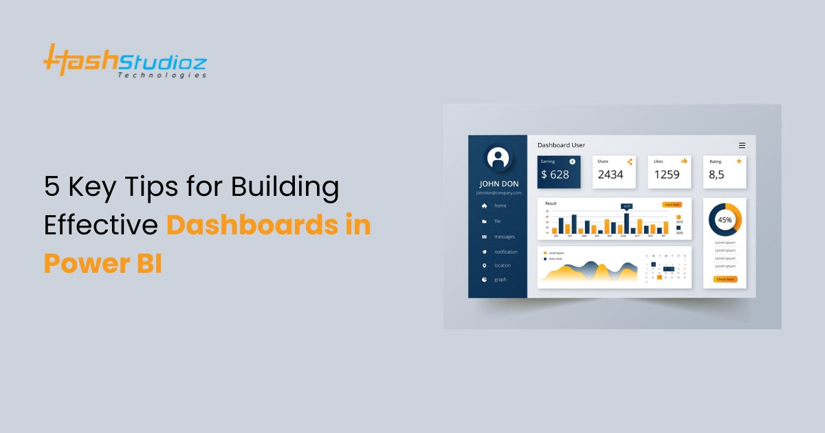
Power BI has revolutionized the way businesses analyze and visualize data. In fact, according to a recent study, 93% of organizations have reported a positive impact on their decision-making process after adopting data visualization tools like Power BI. Moreover, businesses that leverage data-driven insights are 5 times more likely to make faster decisions and achieve better outcomes. As one of the most powerful data visualization tools on the market, Power BI enables users to transform complex data into actionable insights through interactive Power BI Dashboards that drive business success.
However, creating impactful dashboards that effectively deliver these insights can still be a challenge. Dashboards need to go beyond simply presenting data—they should communicate critical information clearly and effectively, enabling teams to act on it swiftly. In this article, we will explore 5 tips for creating impactful dashboards in Power BI that not only capture attention but also provide the essential information your team needs to make informed decisions.
Table of Contents
Why Are Dashboards Important in Power BI?
Before diving into the tips, let’s first discuss why dashboards matter in Power BI. A well-designed dashboard provides a high-level overview of key business metrics, helping stakeholders make quick, data-driven decisions. It’s a central hub where users can track performance indicators in real-time, monitor trends, and gain insights that might otherwise go unnoticed.
However, an impactful dashboard is more than just a pretty interface. It’s about crafting an experience that enhances understanding, encourages exploration, and drives action. With the sheer volume of data businesses have today, clarity is paramount. This brings us to our first tip.
Top 5 Best Practices for Designing Power BI Dashboards
When creating Power BI dashboards, following best practices ensures they are functional and user-friendly. A well-designed dashboard helps users quickly grasp trends, make informed decisions, and access key insights. By adhering to these practices, you avoid clutter, confusion, and performance issues.
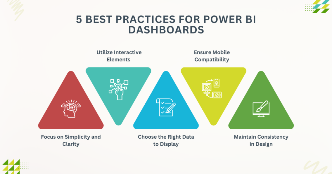
1. Focus on Simplicity and Clarity
When designing dashboards, it’s crucial to prioritize simplicity and clarity. Overloading your dashboard with too many visuals or complicated graphs can overwhelm users and make it harder for them to extract meaningful insights. Instead, aim for a clean, streamlined design that highlights only the most important metrics.
To achieve this, follow these guidelines:
Limit the number of visuals
Choose a handful of key metrics that directly align with your business goals. Avoid cluttering the screen with unnecessary charts or data points.
Use white space effectively
A cluttered dashboard can confuse users. Give your visuals room to breathe by utilizing white space to separate different sections and enhance readability.
Choose the right visuals
Not all data should be represented the same way. For instance, use bar charts for comparisons, line graphs for trends, and pie charts for proportions. Choose visualizations that are appropriate for the type of data you are presenting.
By keeping your dashboard simple and easy to navigate, users will quickly grasp the insights and take action accordingly.
2. Utilize Interactive Elements
Power BI is not just about displaying data; it’s about enabling users to explore and interact with that data. Interactive elements are one of the key features that make Power BI dashboards powerful. These elements allow users to drill down into specific data points, filter data based on criteria, and explore trends more deeply.
Consider adding the following interactive features to your dashboards:
Filters and slicers
These allow users to narrow down the data and focus on specific time periods, regions, or other dimensions. For example, a slicer might let users view sales data for different product categories or specific time frames.
Drillthrough
This feature lets users right-click on a data point and drill through to a more detailed report. For example, users can click on a region in a sales chart and view a detailed breakdown of sales for that region.
Tooltips
Tooltips display additional information when users hover over a data point. This can be a quick way to give users more context without overcrowding the dashboard with excessive text.
These interactive elements empower users to take ownership of the dashboard, helping them derive deeper insights and make more informed decisions.
3. Choose the Right Data to Display
One of the most common mistakes in dashboard design is displaying irrelevant data. If you want your dashboard to be impactful, it’s essential to carefully select the right data that aligns with your business objectives. Not every data point needs to be included – focus on metrics that directly drive decision-making.
Consider the following when selecting data:
Define your goals
Before designing the dashboard, have a clear understanding of what you want to achieve. Are you tracking sales performance? Customer satisfaction? Operational efficiency? Each of these goals will require different types of data.
Avoid data overload
It’s tempting to include as much information as possible, but this can quickly overwhelm users. Choose a few key metrics that tell the most compelling story.
Prioritize actionable insights
Your dashboard should present data that can lead to action. Focus on KPIs (Key Performance Indicators) that have an impact on the business, and make sure users can easily see where attention is needed.
By selecting only the most relevant data, you ensure that the dashboard remains effective and focused, leading to more actionable insights.
4. Ensure Mobile Compatibility
In today’s fast-paced world, decision-makers are often on the go, and they need to access dashboards from various devices. Mobile compatibility is no longer a luxury but a necessity. Power BI offers mobile-optimized dashboards, allowing users to view and interact with their data from smartphones and tablets.
Here’s how to ensure your dashboard is mobile-friendly:
Use responsive design
Power BI allows for responsive designs that adjust to the size of the screen. Ensure that your dashboard layout adapts well to smaller screens without losing functionality or clarity.
Test across devices
Before finalizing your dashboard, test it on multiple devices to ensure it performs well across different screen sizes and resolutions. This will help you identify potential issues and make adjustments.
Simplify for smaller screens
Mobile screens have limited real estate, so avoid overcrowding them with too many visuals. Prioritize the most important metrics and make sure they are easy to interpret on smaller displays.
Creating a mobile-friendly dashboard ensures that users can access critical data and insights from anywhere, enhancing the flexibility and usefulness of your Power BI reports.
5. Maintain Consistency in Design
Consistency in design is crucial for creating an intuitive and user-friendly Power BI dashboard. When all the visual elements are consistent, it helps users easily navigate the dashboard and understand the data without unnecessary confusion. This includes font styles, color schemes, layout, and visual hierarchy.
Here’s how to achieve consistency in your design:
- Use a unified color palette: Select a limited set of colors that reflect your brand and stick to them throughout the dashboard. Avoid using too many bright or clashing colors that can make the dashboard feel chaotic.
- Standardize fonts: Choose one or two fonts for your dashboard, ensuring they are easy to read. Use larger fonts for headings and smaller ones for labels or descriptions.
- Align visuals properly: Ensure that all charts and tables are aligned and sized consistently. Misaligned visuals can make the dashboard feel disorganized and unprofessional.
By maintaining consistency, you not only create a more aesthetically pleasing dashboard but also make it easier for users to navigate and interpret the data.
Power BI Analytics Services: Boosting Dashboard Effectiveness
As businesses increasingly rely on data to drive decisions, many turn to Power BI Analytics Services to maximize the effectiveness of their dashboards. These services provide expert support in designing and implementing dashboards that are aligned with business goals, ensuring that they are impactful and capable of delivering actionable insights.
Working with Power BI Analytics Services can help you:
Improve data integration
These services ensure that your dashboards integrate seamlessly with various data sources, providing a more comprehensive view of your business.
Tailor dashboards to business needs
Power BI Analytics Services can help create customized dashboards that are specifically designed to meet your business objectives and key performance indicators.
Enhance dashboard interactivity
With the support of Power BI experts, you can add sophisticated interactive elements to your dashboards, improving user engagement and insight discovery.
Optimize mobile accessibility
Power BI Analytics Services can assist in optimizing your dashboards for mobile devices, ensuring they remain fully functional on smartphones and tablets.
By leveraging Power BI Analytics Services, you can ensure that your dashboards are not only visually appealing but also functional and optimized for strategic decision-making.
Also Read: Big Data Analytics: Tools, Techniques, and Real-World Applications
Bonus Tip: Regularly Update and Optimize Your Dashboard
A dashboard that’s effective today may not be as impactful tomorrow. Regularly updating and optimizing your dashboard is key to keeping it relevant and useful for your organization. As business priorities change, so do the metrics and data that need to be tracked.
Here’s how to keep your Power BI dashboards up-to-date and optimized:
Monitor changes in business goals
As your company evolves, your dashboard should reflect new KPIs, objectives, or strategies. Regularly assess the dashboard to ensure it aligns with the latest business priorities.
Optimize performance
If your dashboard starts to lag or feel slow, it’s time for optimization. Review the data model, remove unused fields, and simplify complex queries to ensure that your dashboard loads quickly and operates smoothly.
Solicit feedback from users
Regularly ask users for feedback on the dashboard’s effectiveness. Are they able to find the information they need easily? Are there any areas for improvement? Their insights can guide updates and improvements.
By continuously improving your dashboard, you ensure that it remains a powerful tool for decision-making and that it continues to meet your team’s evolving needs.
Custom Power BI Dashboard Design & Development at HashStudioz
HashStudioz is a leading technology solutions provider, specializing in data analytics, business intelligence, and custom software development. Our team of skilled professionals is dedicated to helping businesses unlock the power of their data through innovative solutions.
Our Custom Power BI Dashboard Design & Development services focus on creating dashboards that meet your unique needs. We deliver intuitive, visually engaging, and interactive dashboards that provide real-time insights, enabling informed decision-making. With HashStudioz, you get a powerful, user-friendly tool that transforms your data into actionable insights for business growth.
Conclusion
Creating an impactful dashboard in Power BI is all about striking the right balance between clarity, interactivity, and functionality. By following these 5 tips—focusing on simplicity, utilizing interactive elements, choosing the right data, ensuring mobile compatibility, and maintaining design consistency—you can craft dashboards that not only look great but also provide valuable insights.
Ultimately, a well-designed dashboard can serve as a powerful tool that drives data-driven decision-making and helps businesses stay ahead of the curve. So, whether you’re creating a dashboard for sales, marketing, or operations, remember that less is more when it comes to delivering meaningful insights.
By keeping your audience’s needs in mind and continuously iterating on your dashboard design, you’ll ensure that your Power BI dashboards remain impactful and effective for years to come.
FAQs
- How do I choose the right chart type for my Power BI dashboard?
The choice of chart depends on the type of data you’re displaying. Use bar charts for comparisons, line charts for trends, and pie charts for proportions. Choose visuals that best tell the data’s story.
- Can I make my Power BI dashboard accessible on mobile devices?
Yes, Power BI offers responsive design features that adjust your layout for mobile screens. Test your dashboards on different devices to ensure they look great and are easy to interact with on small screens.
- What are slicers, and how do they improve dashboard interactivity?
Slicers allow users to filter data on the dashboard by specific criteria, such as time or region. They provide interactive elements that let users customize their view of the data for more personalized insights.
- How can I improve the performance of my Power BI dashboard?
Optimizing your data models, reducing unnecessary visuals, and using features like aggregation tables can help improve performance and reduce loading times.
- What should I focus on when designing a Power BI dashboard?
Prioritize the needs of your audience, keep the design simple, and ensure that the dashboard is interactive and user-friendly. Make sure key data points are easy to access and interpret.